Read the outline first
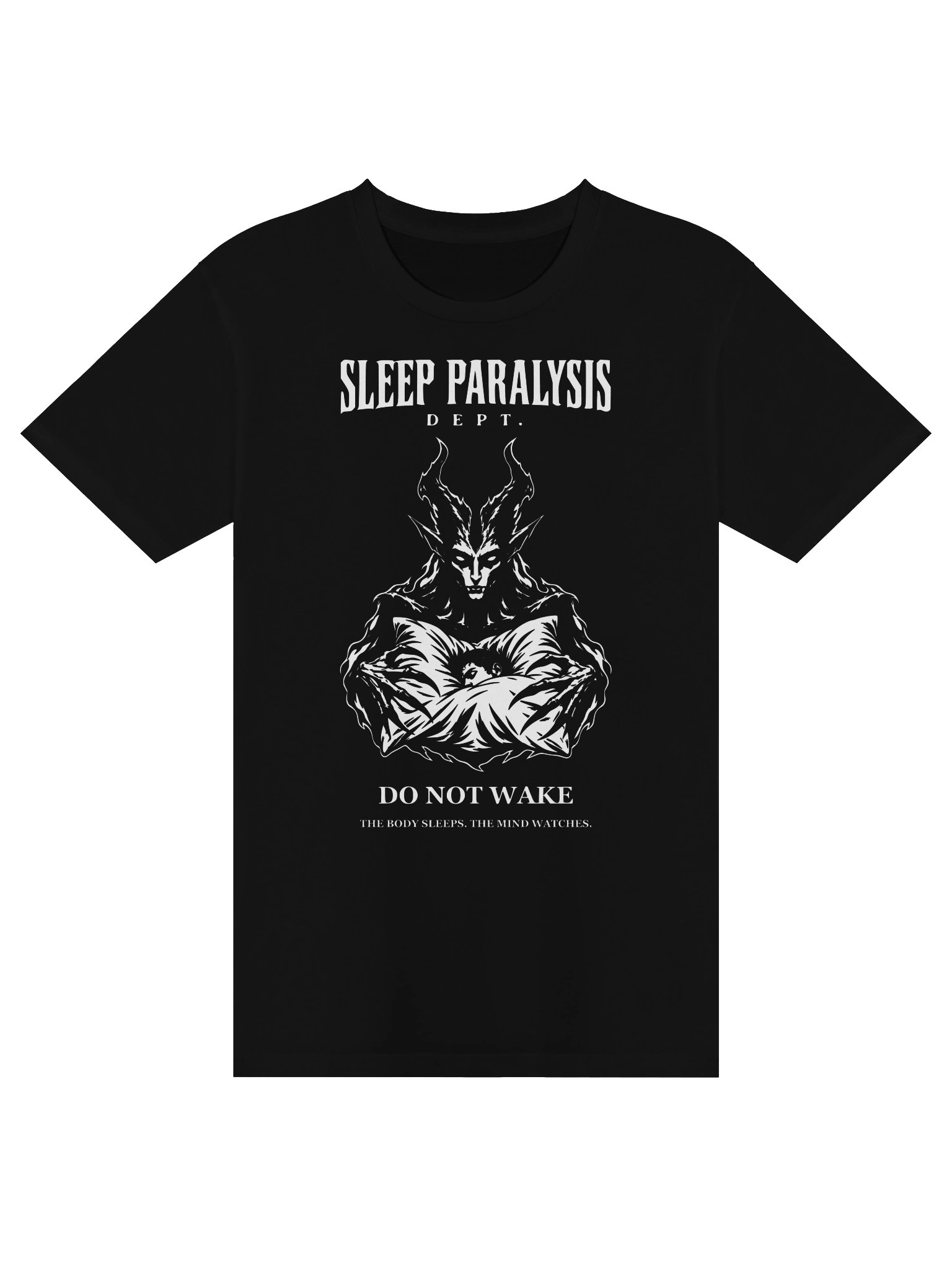
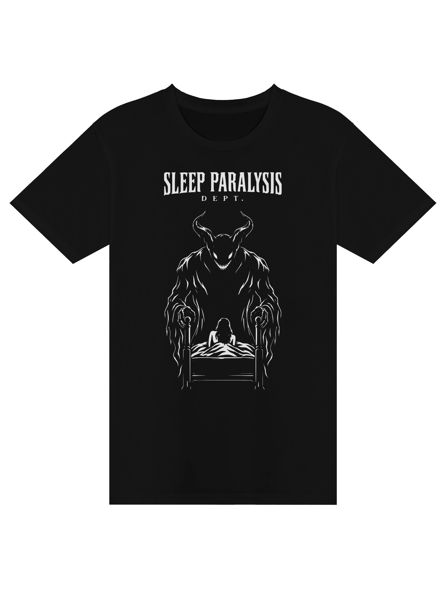
Before looking at teeth, texture, or tiny marks, look at the outline. Where is the weight? What direction does the body suggest? A bowed head can feel watchful or exhausted. A body spread too wide for its setting can make the setting itself seem fragile. These choices are readable before any surface detail arrives.
Use detail with a purpose
An intricate drawing can reward a closer look, but it still needs a hierarchy. We want the face, hands, and strongest shape to lead. Smaller lines should support those anchors instead of competing with them. On black apparel, the unprinted space matters as much as the ink: it holds the darkness inside the figure.
The distance test
Try looking at an image from across the room, then at arm's length. Does it remain recognizable at both distances? Our Do Not Wake and Presence designs approach that question differently, but share the same goal: a strong first impression, followed by details that keep the eye working. This is the department's own design perspective, not a universal rule for horror art.